Theme Schemes (aka. theme mode)
Windows apps can use a light or dark application theme. The theme affects the colors of the app's background, text, icons, and common controls.
This article is about theme schemes (light/dark). If you want to know about accent colors (aka primary color), please see Theming / Accent Color.
Available Schemes
All controls comes with two palette modes: light (the default) and dark.
Light
The light theme is the default theme mode. It is the most commonly used theme mode and designed to be easy on the eyes and provide a good contrast between the background and foreground colors. The light theme is suitable for most applications and is recommended for applications that are used in well-lit environments, also recommended for applications that are used by people with visual impairments.
Dark
The dark theme is designed to be easy on the eyes in low-light environments. It provides a high contrast between the background and foreground colors, making it easier to read text and see icons. The dark theme is recommended for applications that are used in low-light environments, such as at night or in dark rooms.
Change value
By default, your Windows app's theme is the user's theme preference from Windows Settings or the device's default theme. However, you can set the theme specifically for your Windows app.
With ThemeResources (static and globally)
When you use a global ThemeResources, you may find out that there's a property called RequestedTheme. You can use this property to set the default theme mode for your app in XAML. The example App.xaml should look like this:
RequestedTheme="Dark"
<Application x:Class="WpfApp1.App"
             xmlns="http://schemas.microsoft.com/winfx/2006/xaml/presentation"
             xmlns:x="http://schemas.microsoft.com/winfx/2006/xaml"
             xmlns:local="clr-namespace:WpfApp1"
             xmlns:ui="http://schemas.inkore.net/lib/ui/wpf/modern"
             StartupUri="MainWindow.xaml">
    <Application.Resources>
        <ResourceDictionary>
            <ResourceDictionary.MergedDictionaries>
                <ui:ThemeResources RequestedTheme="Dark"/>
                <ui:XamlControlsResources/>
            </ResourceDictionary.MergedDictionaries>
        </ResourceDictionary>
    </Application.Resources>
</Application>
If you want to follow the system settings, you can do this, or simply do nothing:
RequestedTheme="{x:Null}"
With ThemeManager.Current (dynamically and globally)
When you want to dynamically change the theme scheme, you can use the ThemeManager.Current.ApplicationTheme property like this:
ThemeManager.Current.ApplicationTheme = ApplicationTheme.Dark;
For example, here's how a theme toggle button is implemented:
<Button x:Name="Button_ToggleTheme" Content="Toggle Theme" Click="Button_ToggleTheme_Click"/>
private void Button_ToggleTheme_Click(object sender, RoutedEventArgs e)
{
    if (ThemeManager.Current.ApplicationTheme == ApplicationTheme.Dark)
    {
        ThemeManager.Current.ApplicationTheme = ApplicationTheme.Light;
    }
    else
    {
        ThemeManager.Current.ApplicationTheme = ApplicationTheme.Dark;
    }
}
If you want to follow the system settings, you can do this, or simply do nothing:
ThemeManager.Current.ApplicationTheme = null;
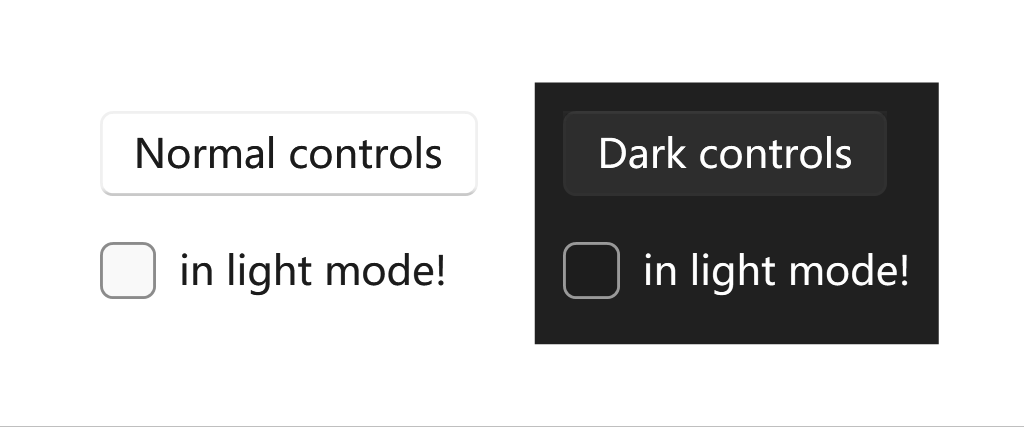
With ThemeManager attached property (locally)
When you want to dynamically change the theme scheme for a specific control, you can use the ThemeManager.Theme attached property like this:
ui:ThemeManager.RequestedTheme="Dark"
Try this example in your project:
<ui:SimpleStackPanel Orientation="Horizontal" Spacing="10">
    <Border ui:ThemeManager.RequestedTheme="Light">
        <ui:SimpleStackPanel Margin="10" Spacing="10">
            <Button Content="Normal controls"/>
            <CheckBox Content="in light mode!"/>
        </ui:SimpleStackPanel>
    </Border>
    <Border ui:ThemeManager.RequestedTheme="Dark" Grid.Column="1"
        Background="{DynamicResource {x:Static ui:ThemeKeys.ApplicationPageBackgroundThemeBrushKey}}">
        <ui:SimpleStackPanel Margin="10" Spacing="10">
            <Button Content="Dark controls"/>
            <CheckBox Content="in light mode!"/>
        </ui:SimpleStackPanel>
    </Border>
</ui:SimpleStackPanel>
If you want to follow the system settings, you can do this, or simply do nothing:
ui:ThemeManager.RequestedTheme="Default"
Remarks
Default value
If you don't specify the theme scheme or you set the default values, the application will follow the system settings.
There are a few scenarios that the app cannot follow the system settings, mostly because the WinRT settings reader doesn't work for some reasons:
-
The app is running on Windows 7/8/8.1, or older versions of Windows 10;
-
In the project settings, the target OS version is lower than
windows10.0.18362.0.