This content is not available in your language. Here's one version in another language that is currently available.
Request TranslationToggleSwitch
Use ToggleSwitch controls to present users with exactly two mutually exclusive options (like on/off), where choosing an option results in an immediate commit. A toggle switch should have a single label.
Examples
Here's how to create a simple toggle switch. This XAML creates a toggle switch.
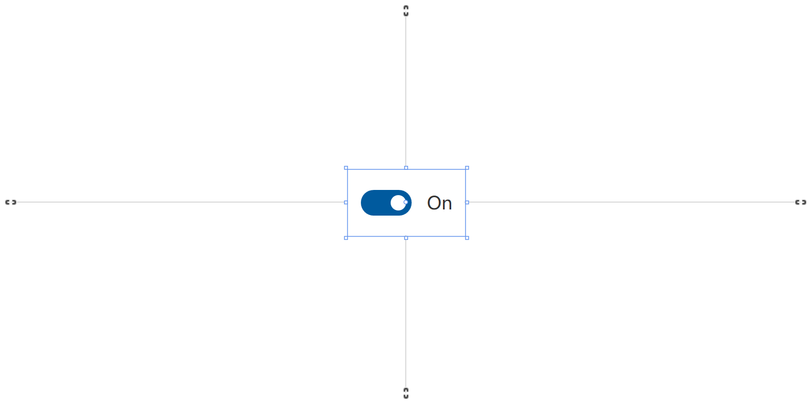
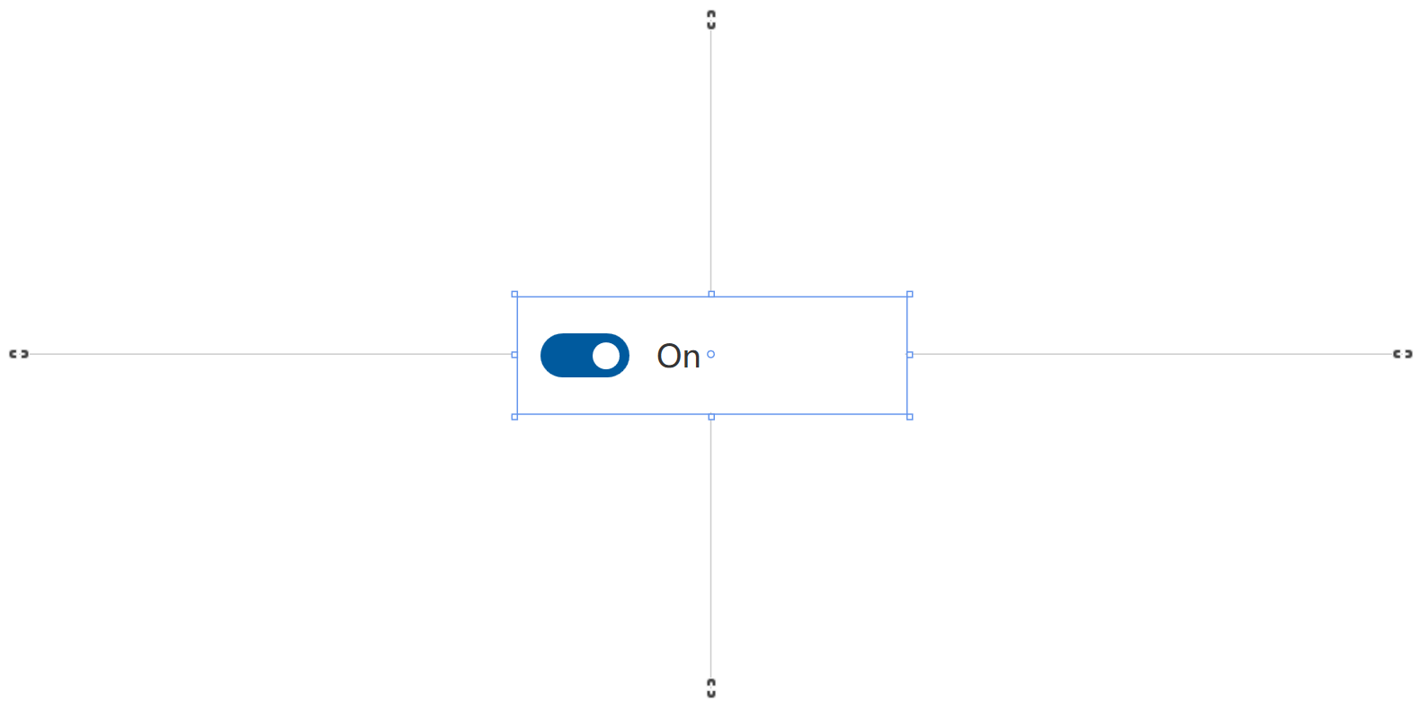
<ui:ToggleSwitch/>
<ui:ToggleSwitch IsOn="True"/>

Then, you can add a header to tell users what this switch does, which will be in the area above the control.
The switch can be either on or off. Use the IsOn property to determine the state of the switch. When the switch is used to control the state of another binary property, you can use a binding as shown here.
In other cases, you can handle the Toggled event to respond to changes in the state.
<ui:SimpleStackPanel Spacing="10">
    <ui:ToggleSwitch x:Name="ToggleSwitch_MainLight" Header="Main Light" Toggled="ToggleSwitch_MainLight_Toggled"/>
    <TextBlock x:Name="TextBlock_MainLightStatus" Text="Try clicking the ToggleSwitch" Opacity="0.5"/>
</ui:SimpleStackPanel>
private void ToggleSwitch_MainLight_Toggled(object sender, RoutedEventArgs e)
{
    TextBlock_MainLightStatus.Text = ToggleSwitch_MainLight.IsOn
        ? "The main light is turned on"
        : "The main light is turned off";
}

Remarks
Is this the right control?
Use a toggle switch for binary operations that take effect right after the user flips the toggle switch.
Styles
There is one built-in style for Button control:
- DefaultCheckBoxStyle: The default style for CheckBox, you can access it with
ui:ThemeKeys.DefaultCheckBoxStyleKey.
Think of the toggle switch as a physical power switch for a device: you flip it on or off when you want to enable or disable the action performed by the device.
To make the toggle switch easy to understand, label it with one or two words, preferably nouns, that describe the functionality it controls. For example, "WiFi" or "Kitchen lights."
Choosing between toggle switch and check box
For some actions, either a toggle switch or a check box might work. To decide which control would work better, follow these tips:
-
Use a toggle switch for binary settings when changes become effective immediately after the user changes them.

In this example, it's clear with the toggle switch that the kitchen lights are set to "On." But with the checkbox, the user needs to think about whether the lights are on now or whether they need to check the box to turn the lights on.
-
Use check boxes for optional ("nice to have") items.
-
Use a checkbox when the user has to perform extra steps for changes to be effective. For example, if the user must click a "submit" or "next" button to apply changes, use a check box.
-
Use check boxes when the user can select multiple items that are related to a single setting or feature.
-
Use the default On and Off labels when you can; only replace them when it's necessary for the toggle switch to make sense. If you replace them, use a single word that more accurately describes the toggle. In general, if the words "On" and "Off" don't describe the action tied to a toggle switch, you might need a different control.
-
Avoid replacing the On and Off labels unless you must; stick with the default labels unless the situation calls for custom ones.
Compact Sizing
If you are using ToggleSwitch in a compact layout, you might find out that even if the check box has no content, it takes an amount of space. This is because the MinWidth property is set in the default style.
To fix this, you can simply set MinWidth property to 0 like this:
<ToggleSwitch MinWidth="0"/>